Fluid typography using CSS – calc() and Viewport Width
Filed under: Code
Comments: Comments Off on Fluid typography using CSS – calc() and Viewport Width
I just thought I’d quickly share how to use CSS to set up fluid typography. By that I mean:
Fluid typography is text which size adapts … erm … fluidly to a device’ screen width.
I was recently inspired by this great post on the subject by Michael Riethmuller. After reading the post I set out to realize it on a WP Theme project that I am currently working on (more on that at some other point). And this is what I aimed to achieve:
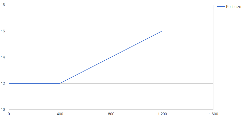
- For devices less than 400px wide, font-size should be 12px
- For devices more than 1200px wide, font-size should be 16px
- In between 400 and 1200px, font-size shoudl increase linearly
Like this:
To do this, I use the following CSS
html {
  font-size: 12px; // Default
}

/* Modern browsers fluid typo */
@media screen and (min-width: 400px) {
  html {
    font-size: 14px; /* Fallback for older browsers */
    font-size: calc( 12px + ( ( 16 - 12 ) * (100vw - 400px) / (1200 - 400) ) );
  }
}
@media screen and (min-width: 1200px) {
  html {
    font-size: 16px;
  }
}
Basically, it is the calc() function that does the trick. Calc simply does any calculation that you specify. Also, I make use of the vw-unit where 100vw translates to 100% of the viewports width, in px.
Written out and simplified it states:
12px + ( 4 * (ViewportWidth - 400px) / 800 )
To see how this will pan out, we can look at how different ViewportWidths
- 600px -> 13px
- 800px -> 14px
- 1000px -> 15px
That’s what I call fluid typography! I hope that this will help some of you to also take advantage of this sweet way of scaling text!